
moov
Branding
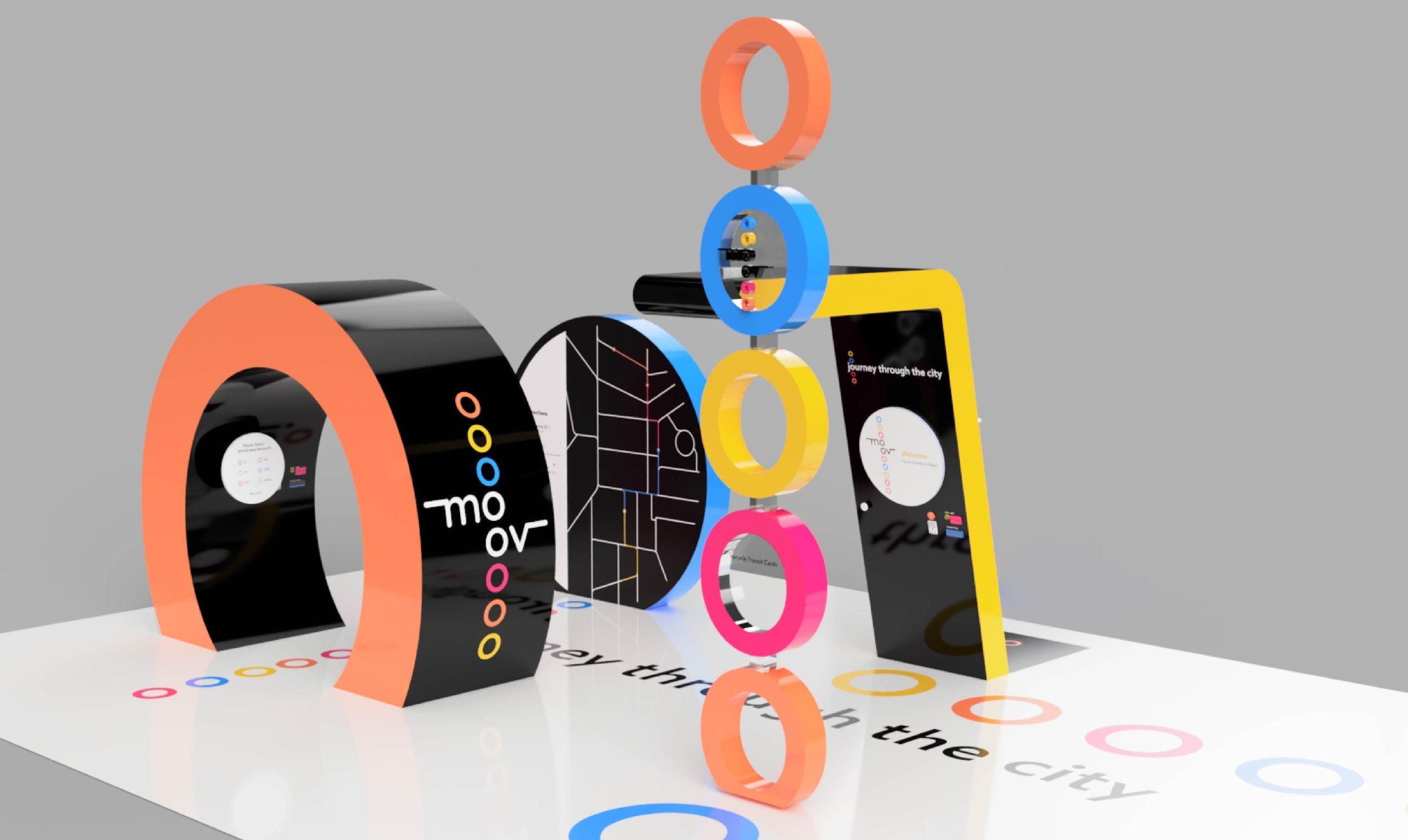
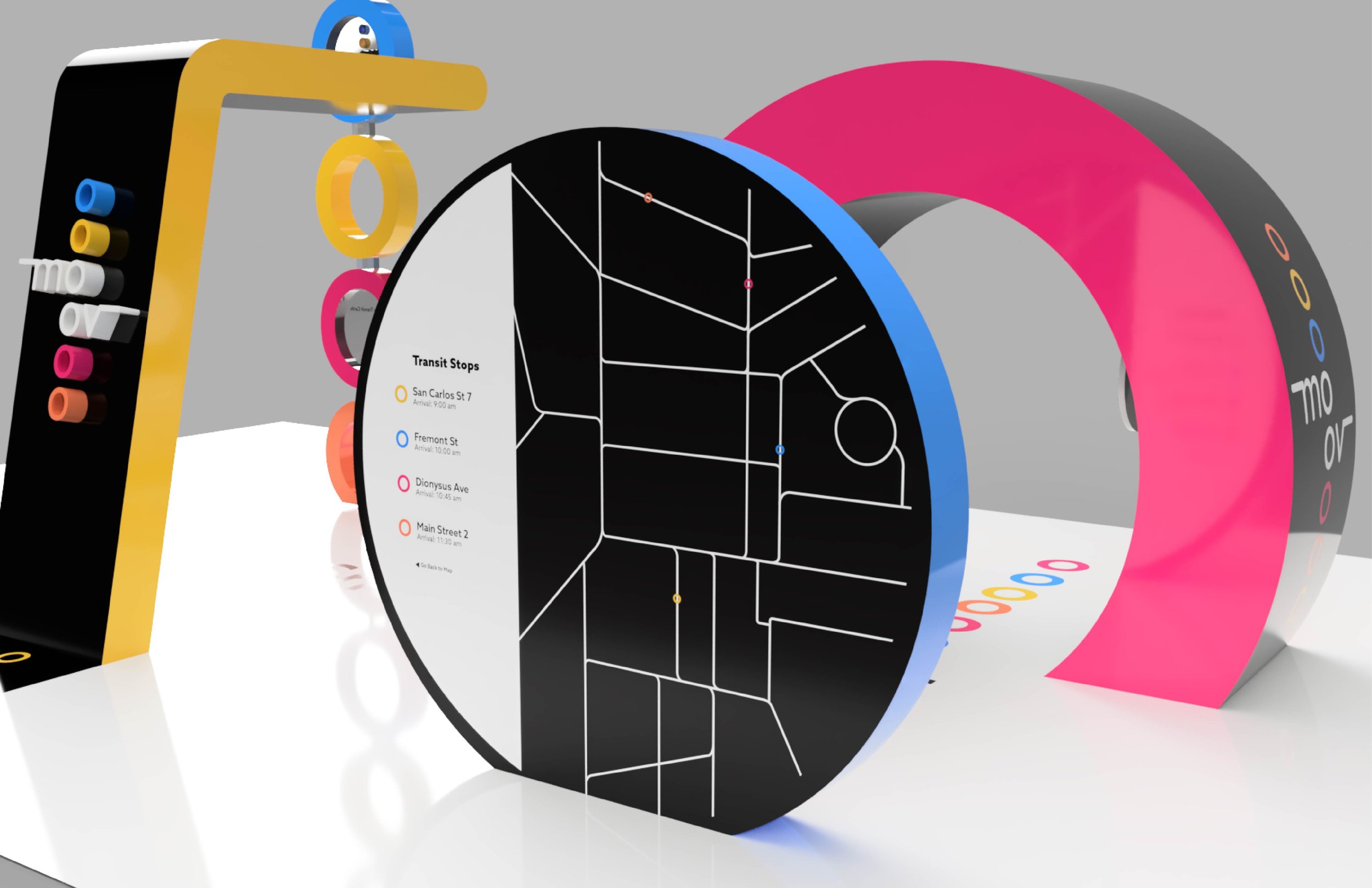
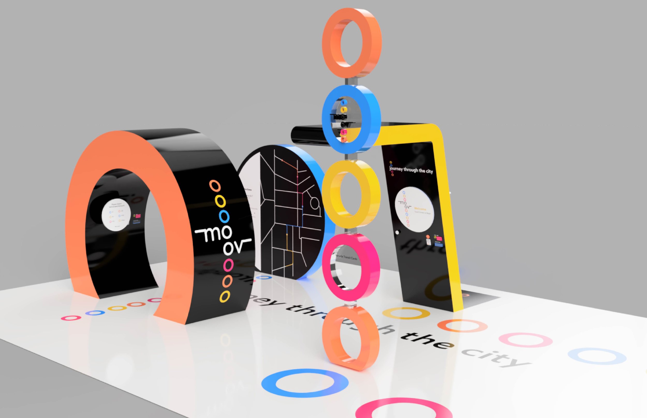
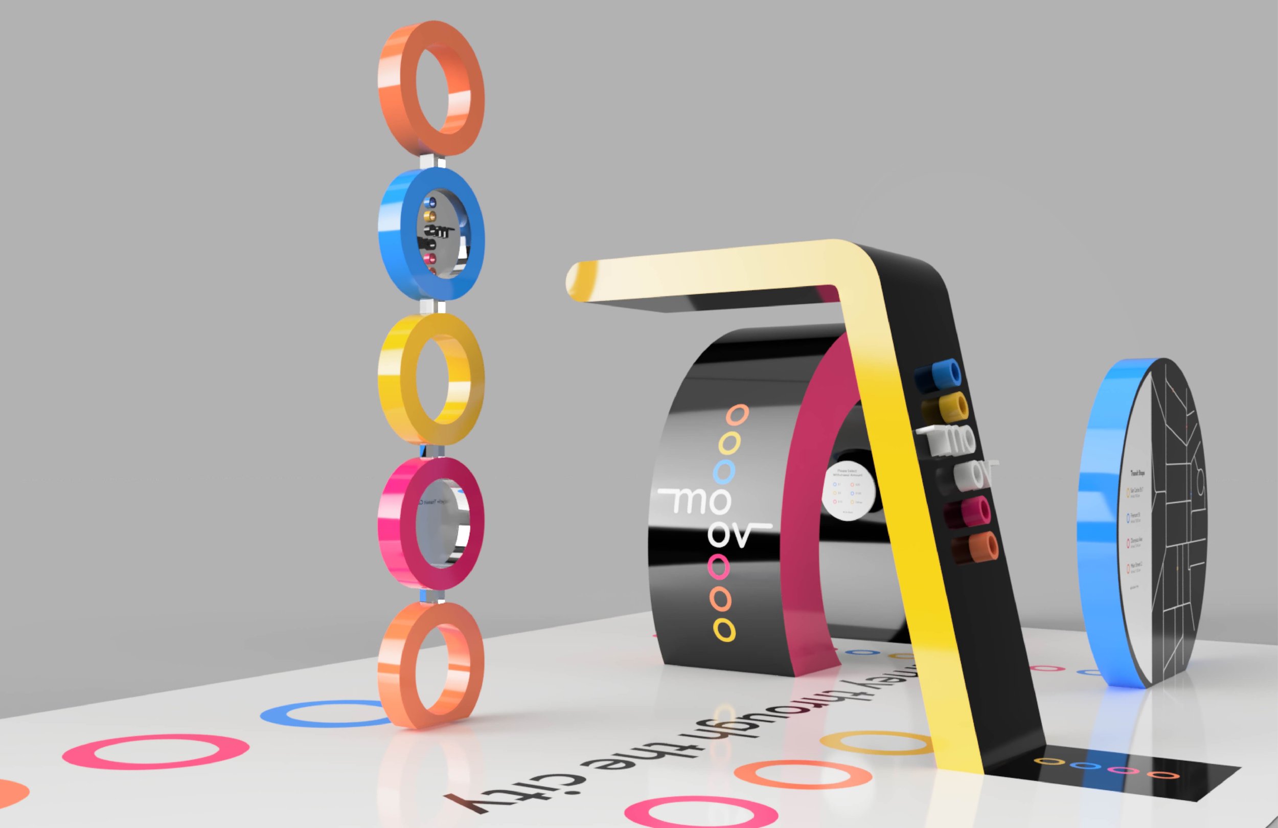
3D Kiosk Design
Objective
Create a brand for a point-of-purchase concept and design a 3D kiosk experience.
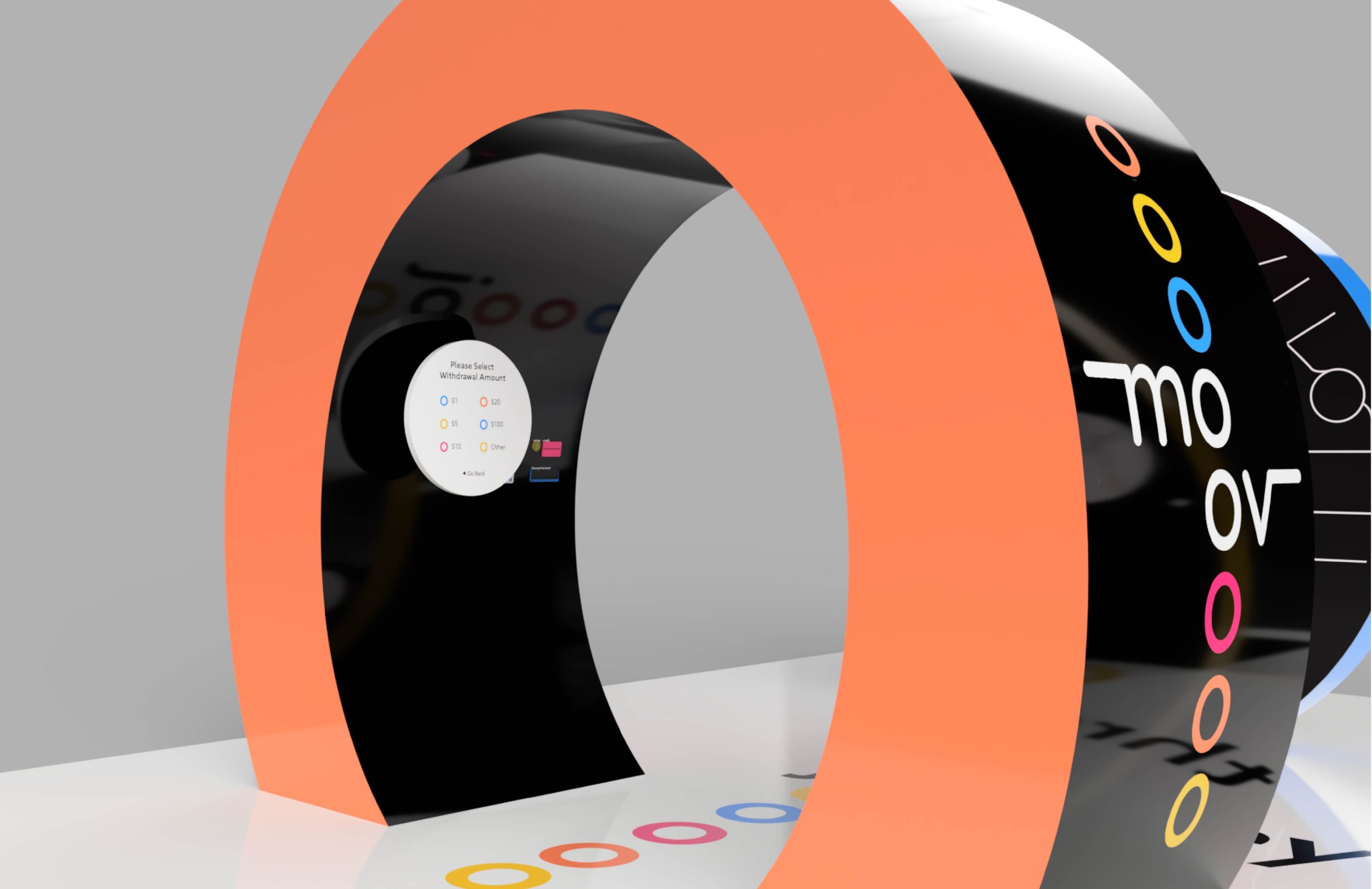
moov is a point-of-purchase site that unifies the Bay Area transit system in providing an easier and smoother journey to your next location. moov is located in the Bay Area and takes on a new and fun approach through its branding. moov provides easy-to-access and easy-to-understand information about the Bay Area transit system. Along with live transit times and the fastest route to your next location. Aside from transit information visitors will be easily able to set up, purchase, or refill their transit car via phone or on site. With moov we want to ensure that your journey through the city is smooth, safe, and easy.
Logo Design
moov utilizes circles and lines within the logotype. The stacking of the “o”s represents location in how moov is here to get you smoothly and safely to the many locations of yours. The extension of the lines represents the traveling movement of public transportation. The lines also references to the lines used within the transit system maps.
The stacked colored “o”s must have the minimum use of four, but the “o”s can be infinitely stacked depending on the usage and location of the logotype.

Branding
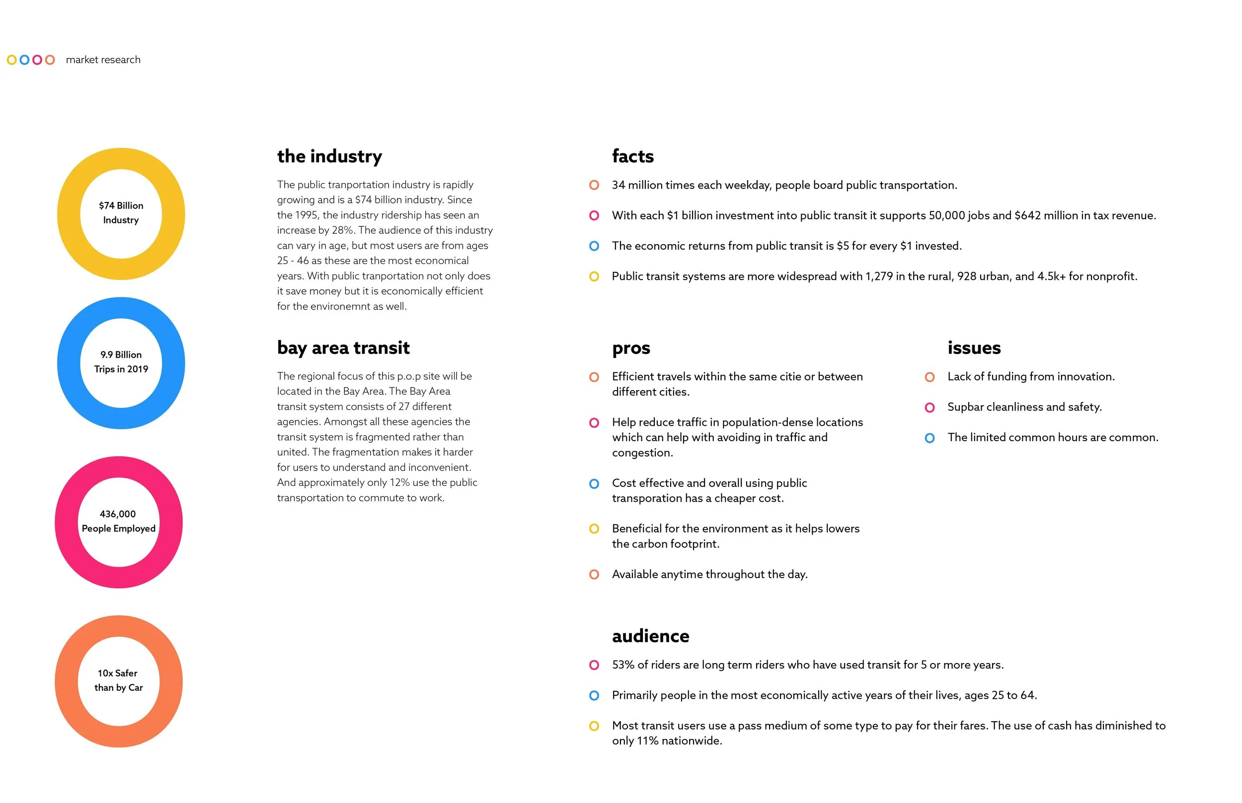
Market Research
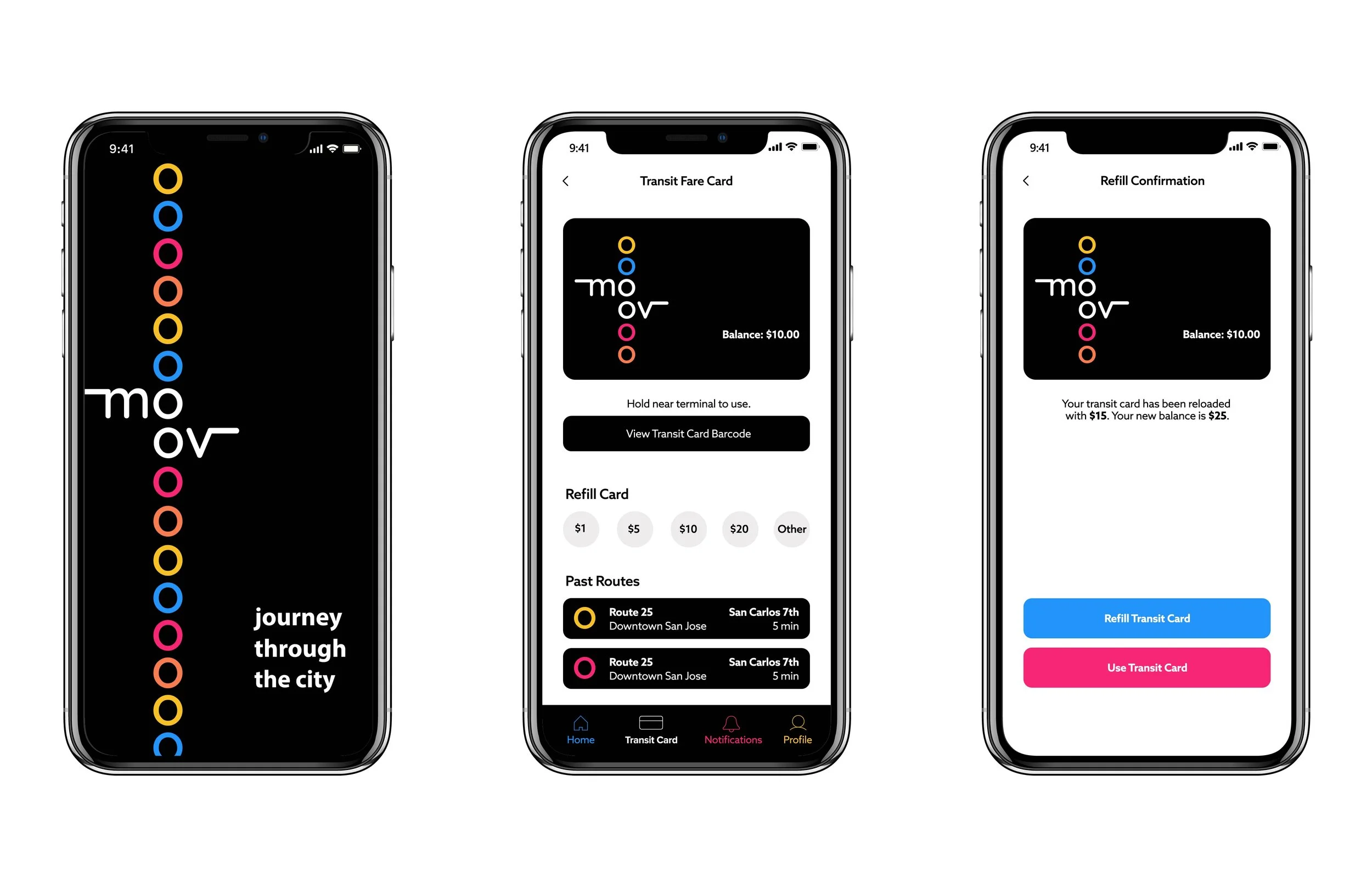
App UI
Final Renders
moov Transportation Card