World Food Programme
Branding
Motion Graphic
Illustration
Objective
Create a modern and innovative brand for a intergovernmental organization.
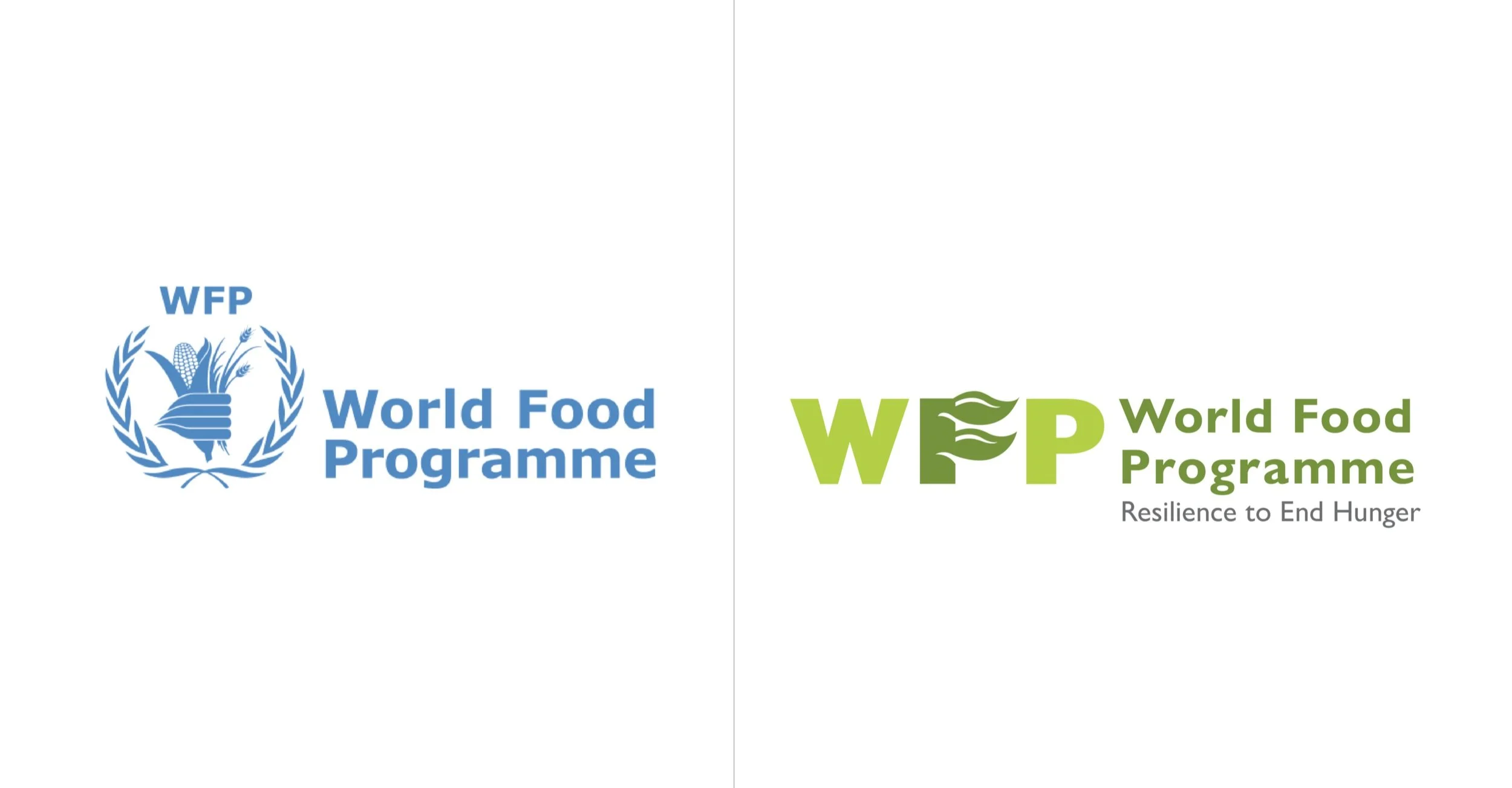
The World Food Programme (WFP), is the largest humanitarian organization in addressing hunger and promoting food security. The goal for this project was to create a refreshing, unique and modern look that would represent WFP. I wanted to convey the organic and growth aspect of agriculture as WFP services are mainly in third world countries and there are more agriculture and crops within those regions. The use of flowy and organic shapes represents the organic aspect of food grown. The main logo is a lettermark logo and with the F presented as a growing stock to symbolize the food brought to help others in need. The new design hopes to embody the concept of growth and connection brought to people around the world through the power of food.
Main Logo Rebrand
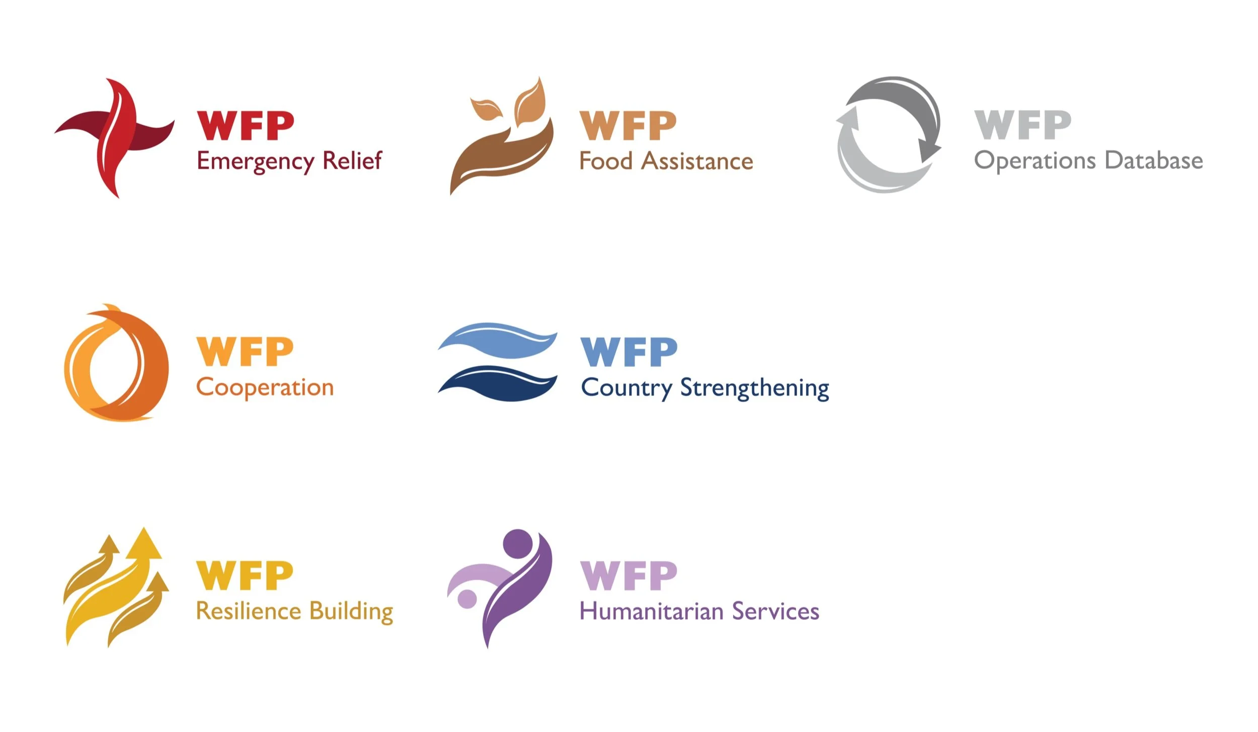
Sub Brands Logos
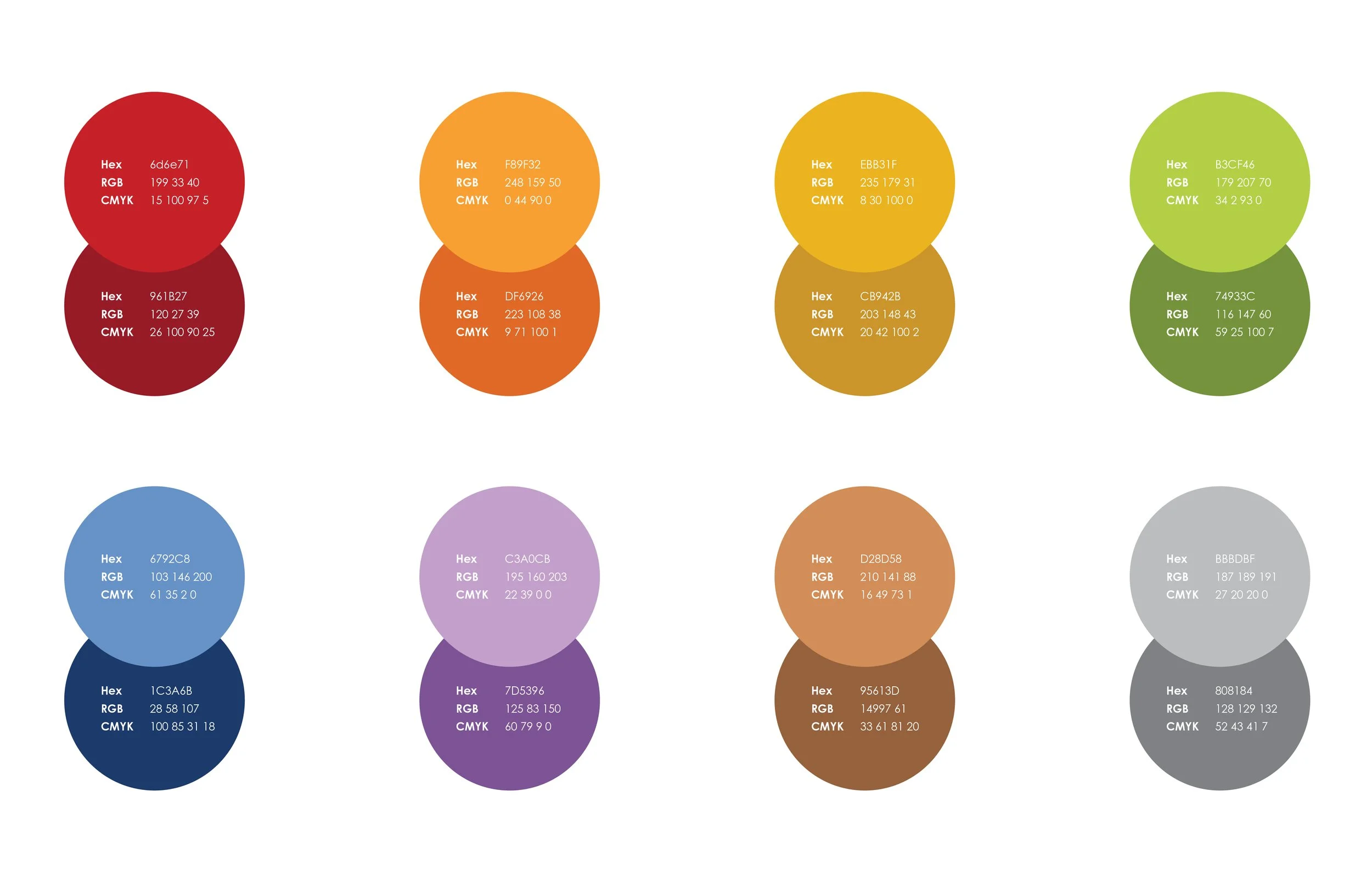
Brand Colors
Motion Graphic

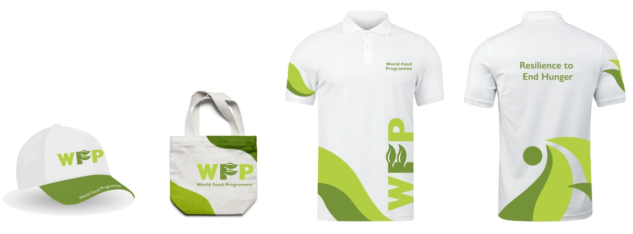
Brand Applications