
simpli.
Branding
Packaging Design
Sustainability Research
Project Brief
Create a set of branded liquid-based products. Develop two different forms.
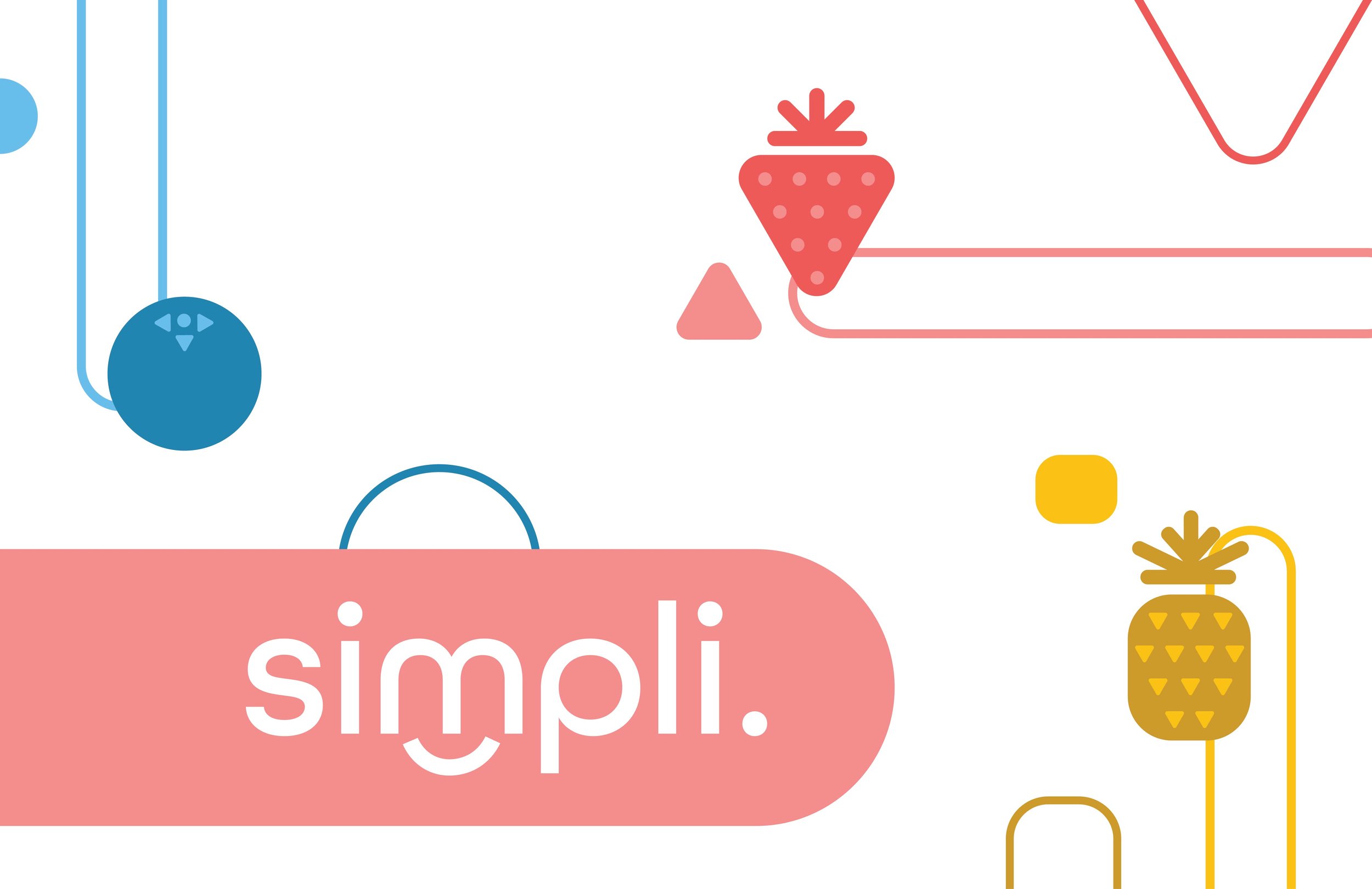
Simpli. is a probiotic yogurt brand that strives to provide a healthy and delicious yogurt for your health through the use of simple and natural ingredients. The use of simple geometric shapes and playful colors was aimed at creating a new refreshing, fun, lively, and minimal look to probiotic yogurt. The bottle shape fits with the geometric usage and emulates the shape of a probiotic.

Logo Design
The logotype is designed with a round and geometric typeface to capture the idea of simplicity and playfulness in Simpli. yogurts. The logotype is clean-cut and minimal, but the roundness within brings in the fun and soft aspect. The arched curve under the letter M creates a smile. The smile is placed under the M as it represents the Simpli. yogurts should make consumers feel consuming our products, happy and refreshed.
The logotype is designed to be interchangeable with the different colors according to simpli.’s flavors.
Final Packaging Designs


